

Think about the last great movie you went to see.
You’re sitting in the theatre with a bucket of popcorn in your lap (extra butter) and a cold coke in your hand. The lights are dim. The last preview fades away and the movie begins.

As the story unfolds, you gradually pick up key pieces of the story. You aren’t dropped right in the middle of the main action and expected to understand what’s going on.
At the same time, you aren’t lectured on plot points and character flaws; there are brief bursts of action, flurries of intrigue designed to keep you engaged and wanting more.
This is great onboarding.
User Onboarding is the process of increasing the likelihood that new users become successful when adopting your product.
-Samuel Hulick, founder of UserOnboard.com
When your users are more successful, conversion rates increase, churn decreases, and your business grows.
Groove, the wildly popular customer support software, reduced churn by 71% when they made improvements to their onboarding!
So, how can you take onboarding for your SaaS startup from B-list to Oscar-worthy?
In this post, we’ll go over six strategies you can implement in your product today. We’ll use real examples from companies doing it right, and a couple that can do it better.
1. Stunt a little – use social proof to get buy-in from users
We are social creatures. Most of us don’t want to be the first one to do something. We go where other people have already gone before.
Derek Sivers illustrates this perfectly in his TedX talk, “Leadership Lessons from the Dancing Guy.”
https://www.youtube.com/watch?v=fW8amMCVAJQ
His main point is to prove the power of the first follower. But he also shows how we’re much more likely to adopt a movement if we see other people joining in as well.
The UX world calls this “social proof.” It’s more fun to call it “stunting.”
The most common forms of social proof are:
- Testimonials (what we’ll be focusing on)
- Logos from well-known companies using your product
- Press coverage
Basecamp does an incredible job of using testimonials to encourage users.
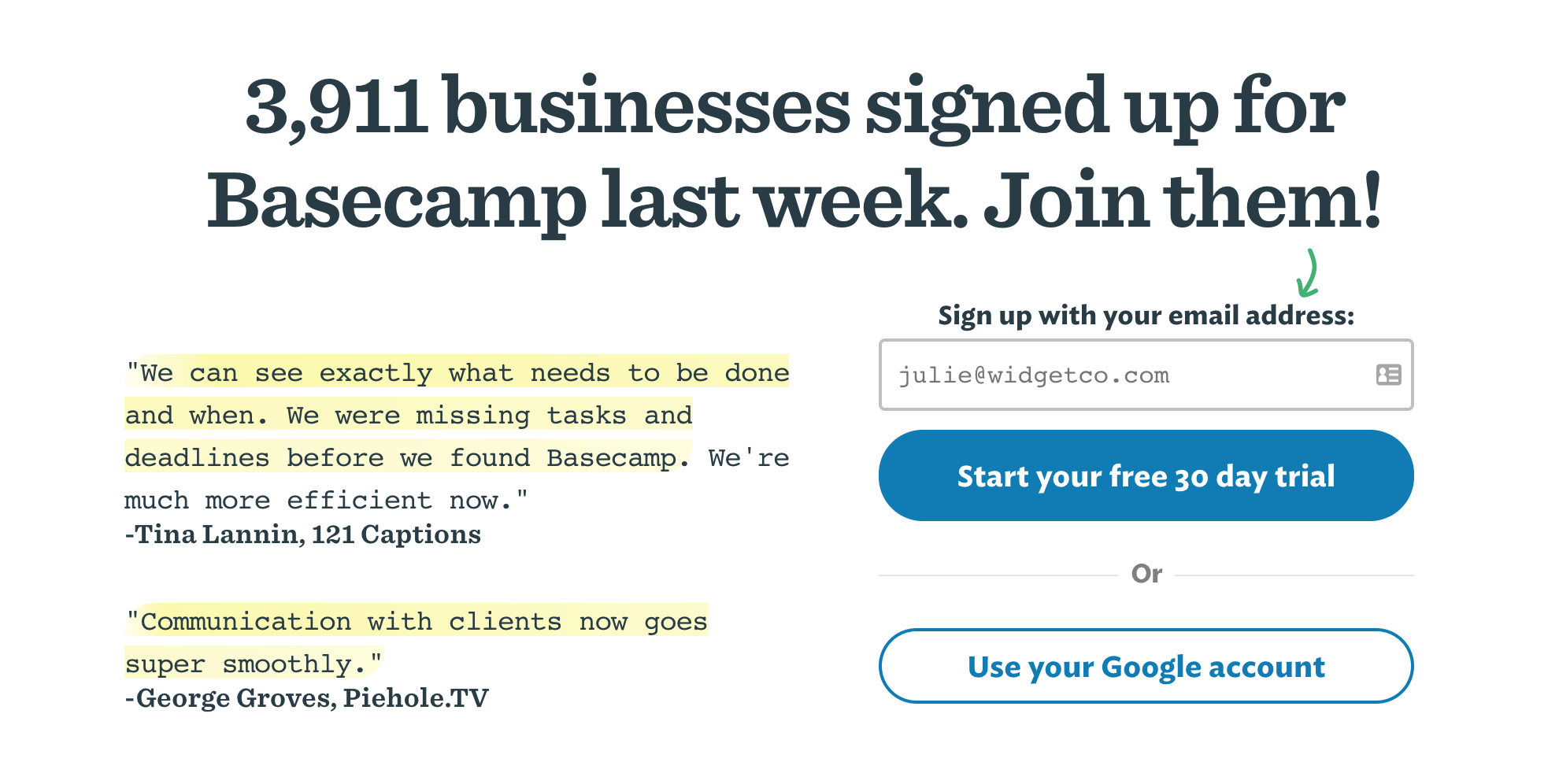
They have an entire page on their site with 1,000 testimonials from users! That’s some awesome social proof.
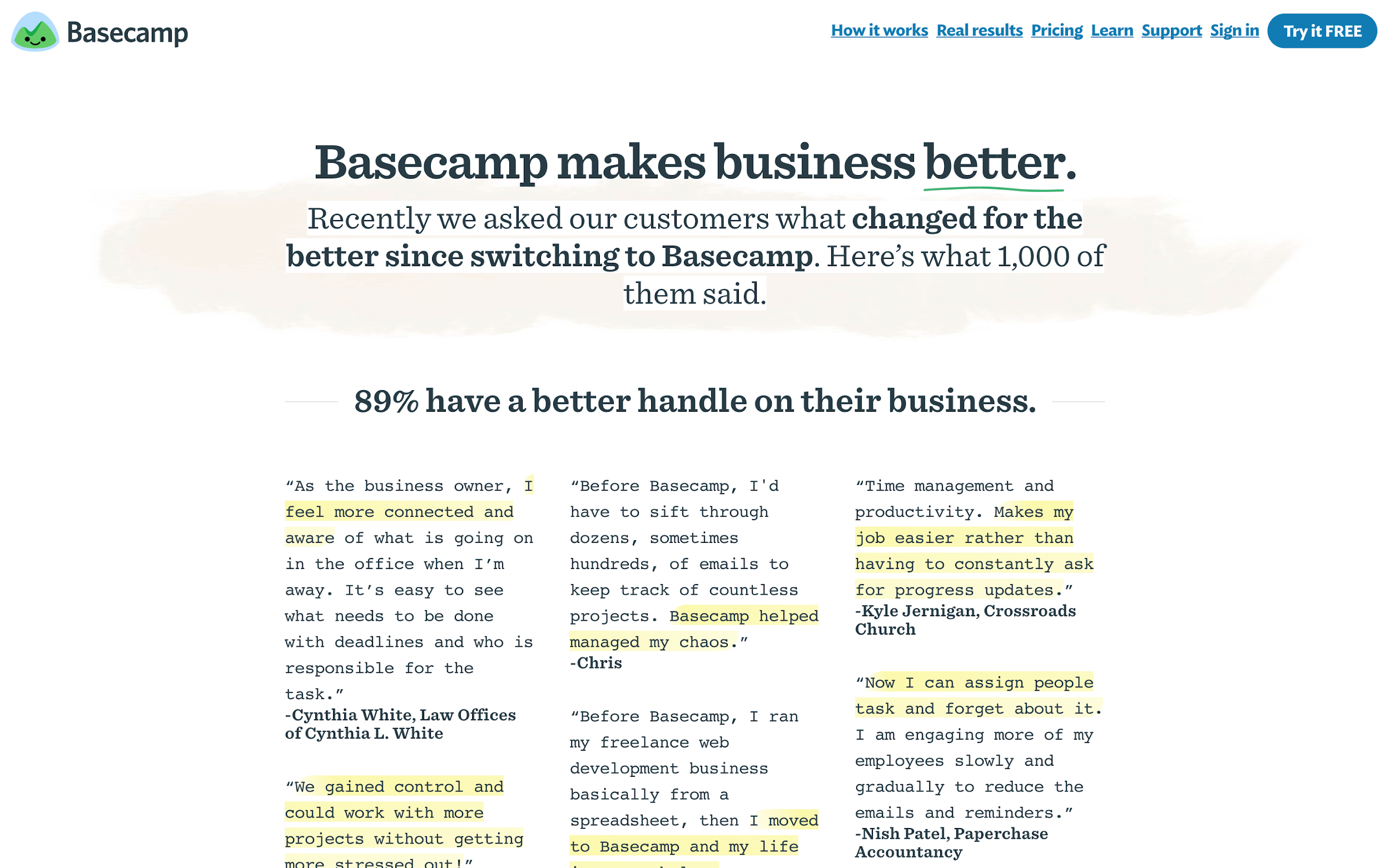
Take it a step further by including faces. Faces have been shown to draw the eye, improve trust, and invoke emotional responses. Showing pictures of your customers alongside their testimonials is an easy win.
Bonus points for taking the time to get testimonials from a diverse set of customers. You’ll appeal to a wider subset of your target audience if your testimonials better represent the diversity of your customer base.
Now that we've got your attention 🙂
Are You Ready to Experience Webinar Software from the Future?
No Credit Card Required - Get Started in Seconds.
2. Write like a human being
One of the biggest changes you can make to your onboarding is improving your microcopy. If you’re an early-stage SaaS company, don’t try to write like a stiff corporate giant. That’s not who you are. Use your size to your advantage and have some fun with your copy. You don’t have to be super corny, just focus on being friendly.
Here’s a few places to look at the copy you’re using and see if you can do better:
Descriptive button states
You should always be thinking from the perspective of the user. Make it as easy as possible for them to understand and get excited about how successful you’re going to make them.
So, why does your button say, “signup”?
A user signing up puts money in your pocket, but what does it do for the user? Look at buttons as another chance to illustrate your value prop and build excitement.
Albatross is a tool to help software developers create more accurate project estimates (Disclaimer: my company built it). A user trying out Albatross doesn’t want to sign up for another email newsletter, they want to create a project.
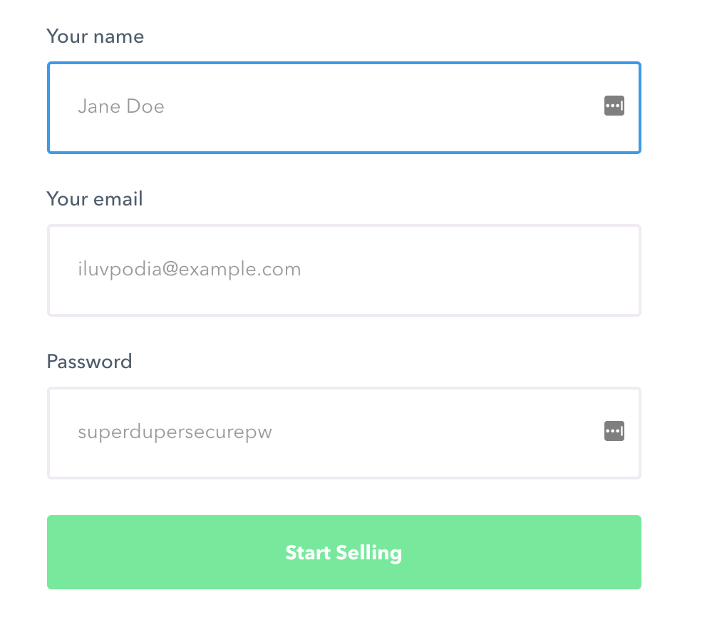
Podia makes it super easy to create and sell online courses and digital products.
The copy on their site is an incredible example of engaging microcopy.
Their main call-to-action speaks directly to what their users actually want to do: they want to start selling their content.
Helpful, human explainers
Take all the guesswork out of your signup flow. If there’s a field that could be confusing, don’t keep your users guessing. Explain it to them up front. Especially if you have specific password requirements. There’s nothing more annoying than having to come up with a new password.
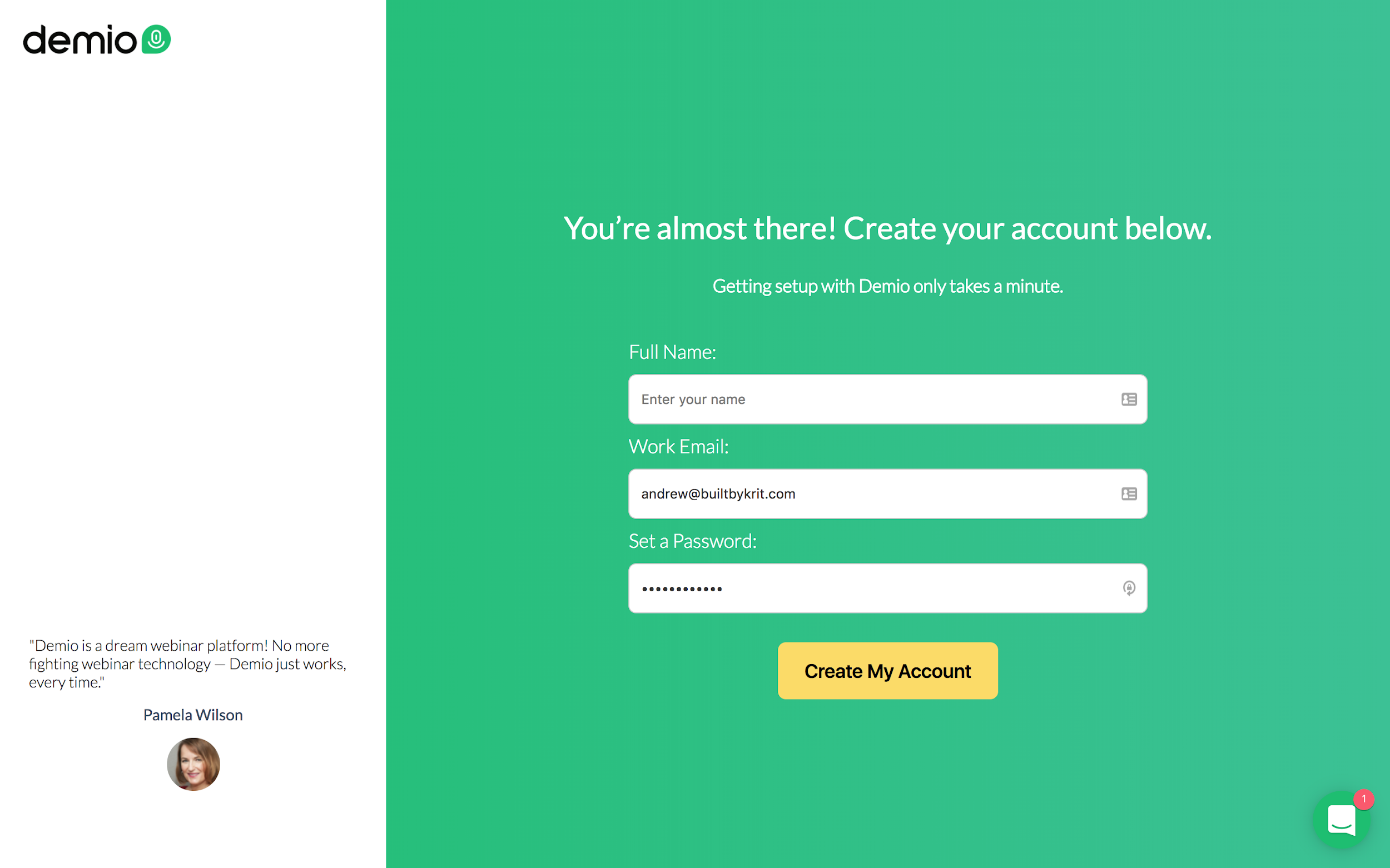
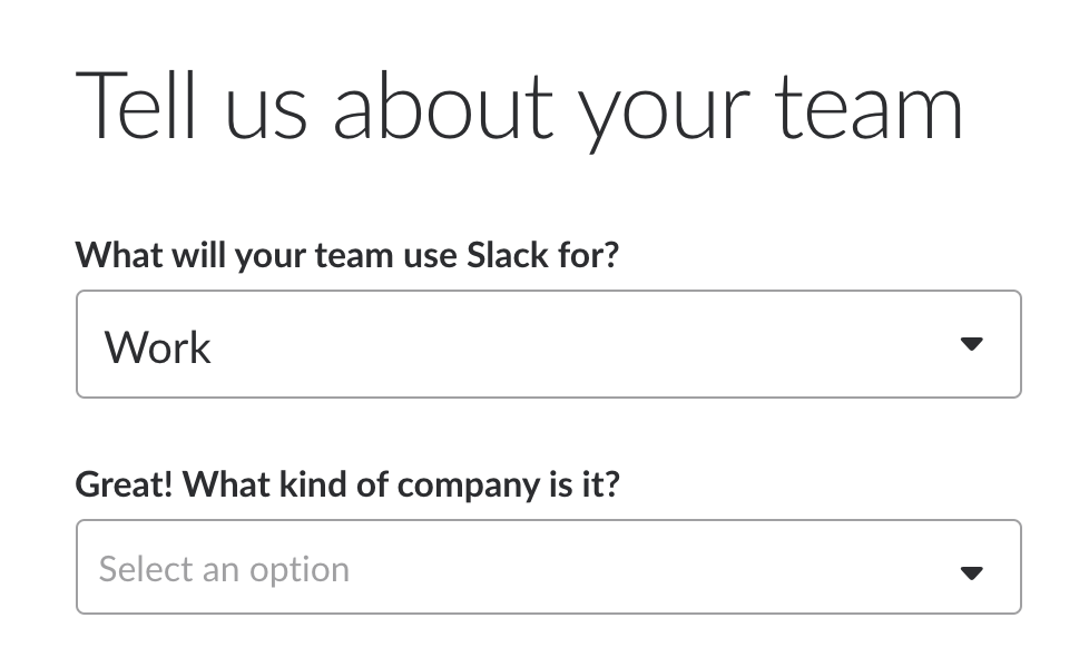
Wealthfront is an automated investment advisor. They have a relatively complicated signup flow because they have to.
But they do a great job of taking the guesswork out of the process with simple explainer copy throughout.
Success messages
Offer subtle praise to your users along the way. Everyone likes to hear that they’re doing a good job. They’re doing something important for you, so make them feel good about it.
You don’t have to go overboard, but throw an exclamation point in there now and again.
3. Don’t come on so strong
Let’s be honest for a second, we’re all lazy.
We know exercise is good for us, but spending five more hours flipping through cat pictures is so much easier.
I know your SaaS product will help me get more done, but you want me to fill out ten whole fields?! Ugh, that sounds so hard.
Just look at this Salesforce signup page. It makes me want to do some more research before signing up for anything.
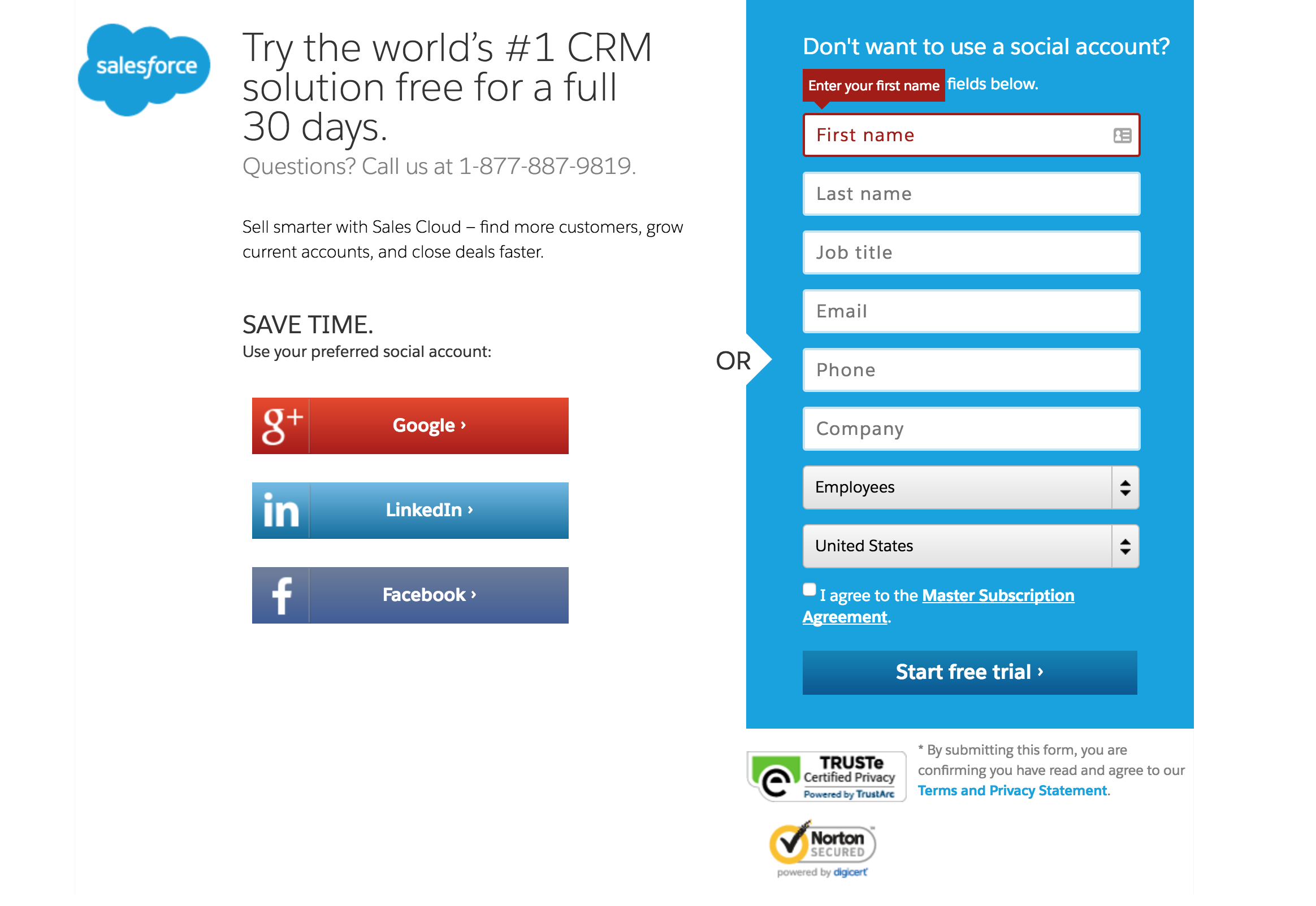
Make your signup flow feel easy to your users. Break it up into small, bite-sized chunks to reduce that overwhelming feeling.
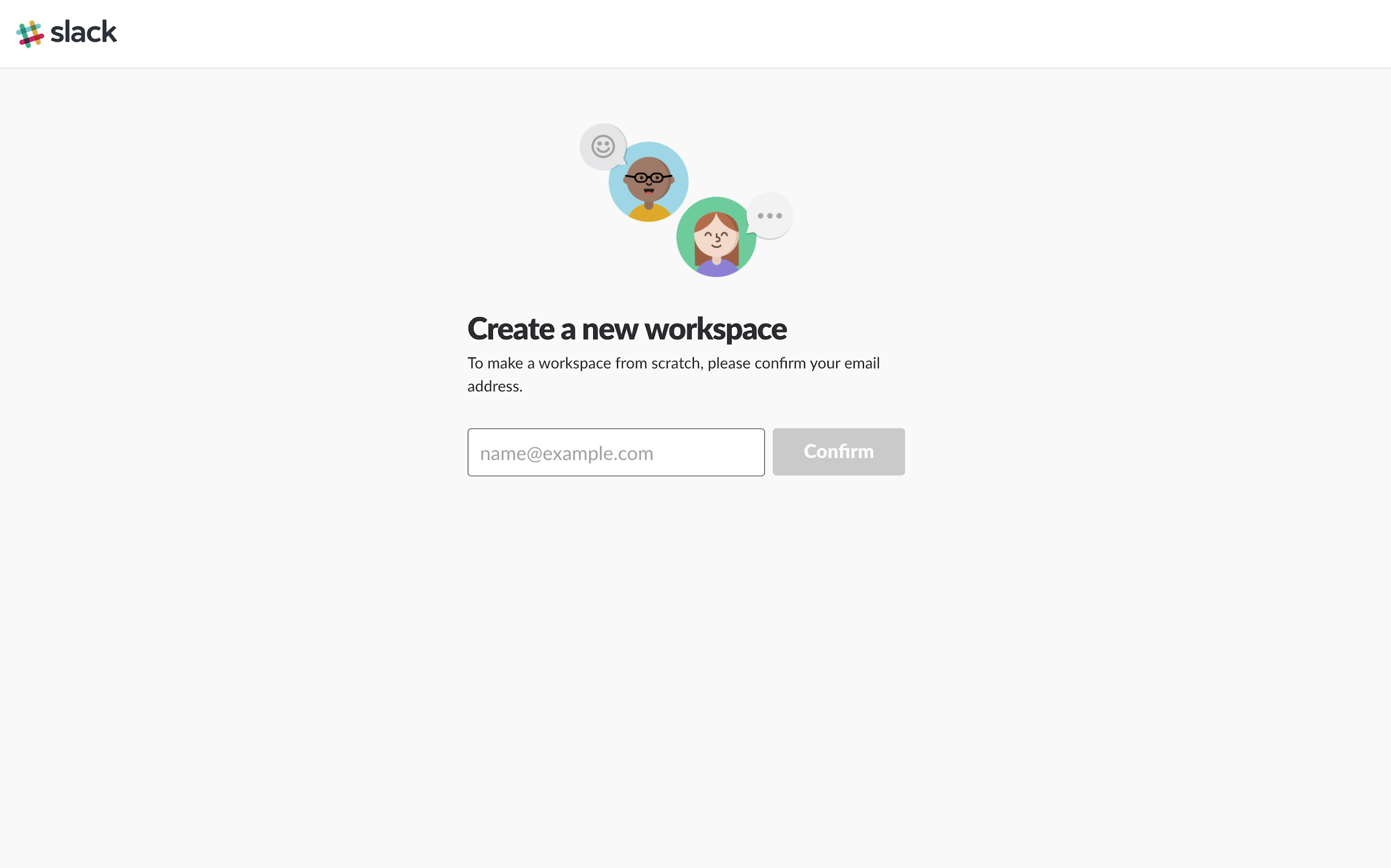
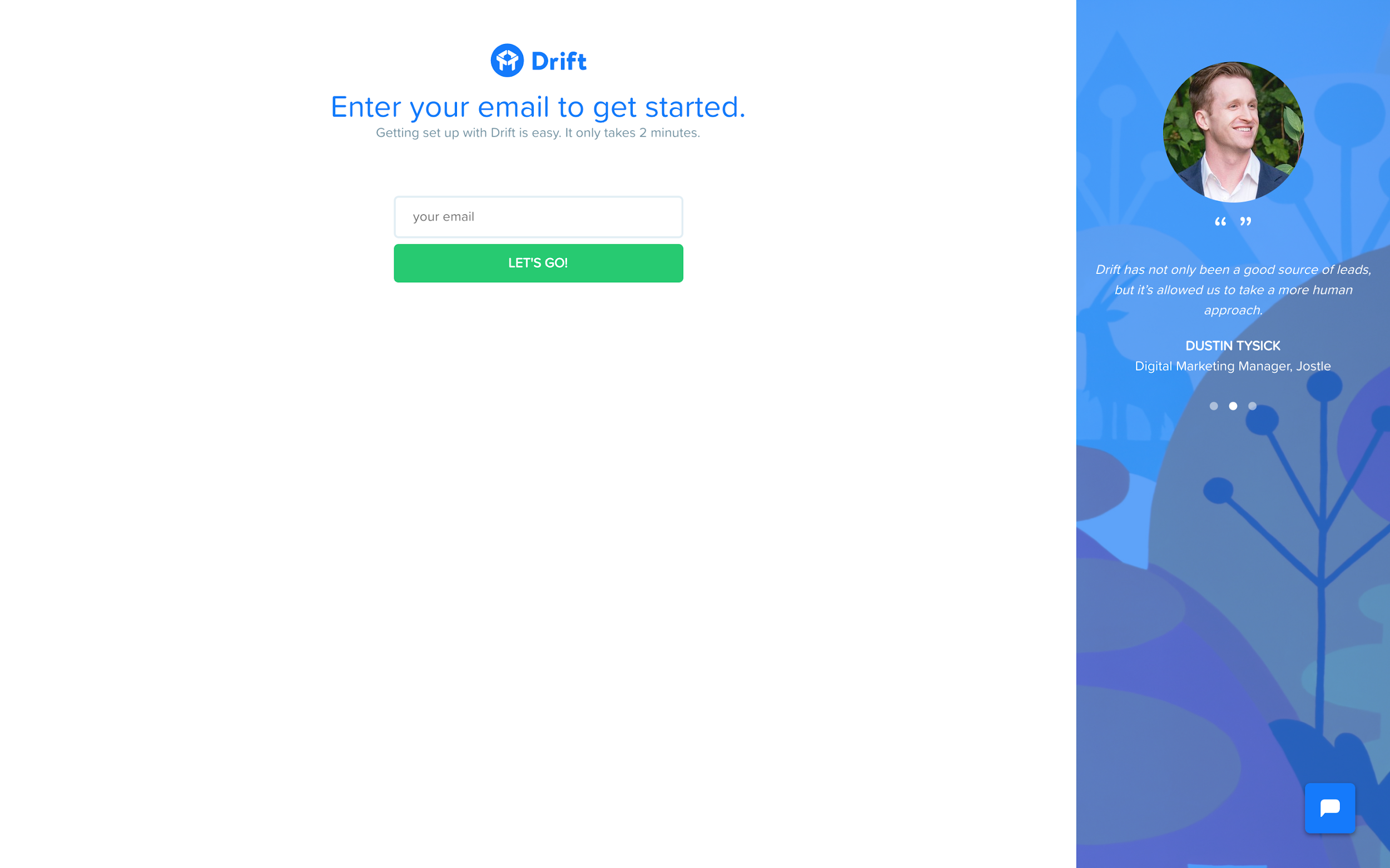
Slack is the master of gradual engagement. When you sign up for Slack, they don’t ask for your name, a password, team info, etc. At least, not at first.
There’s only one field on the first page of their signup flow.
Enter your email to create a new workspace! That’s not so hard.
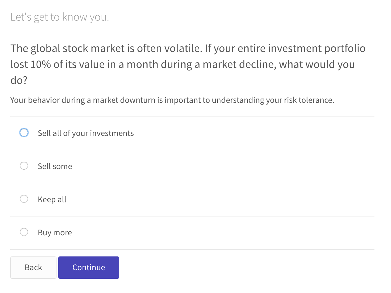
Wealthfront takes another creative approach towards gradual engagement. They let you answer questions to build your investment profile without creating an account.
They only ask you to create an account if you like what you see. Still not ready? No worries, enter your email and they’ll save it for you so you can get set up later.
Now that we've got your attention 🙂
Are You Ready to Experience Webinar Software from the Future?
No Credit Card Required - Get Started in Seconds.
4. Create clear visual hierarchies
We’ve already established we’re lazy and need lots of encouragement. Well, good news, we’re also easily distracted.
While writing this blog post, I’ve gotten distracted approximately 563 times.
You don’t want your users to get distracted during your signup flow. That’s a good way for them to get confused and forget about you.
When you add multiple options in your signup flow, make it obvious which one your users should follow. Otherwise, you’re creating an unnecessary way to confuse and lose them.
Know what path you want your users to follow and make it easy for them to find their way.
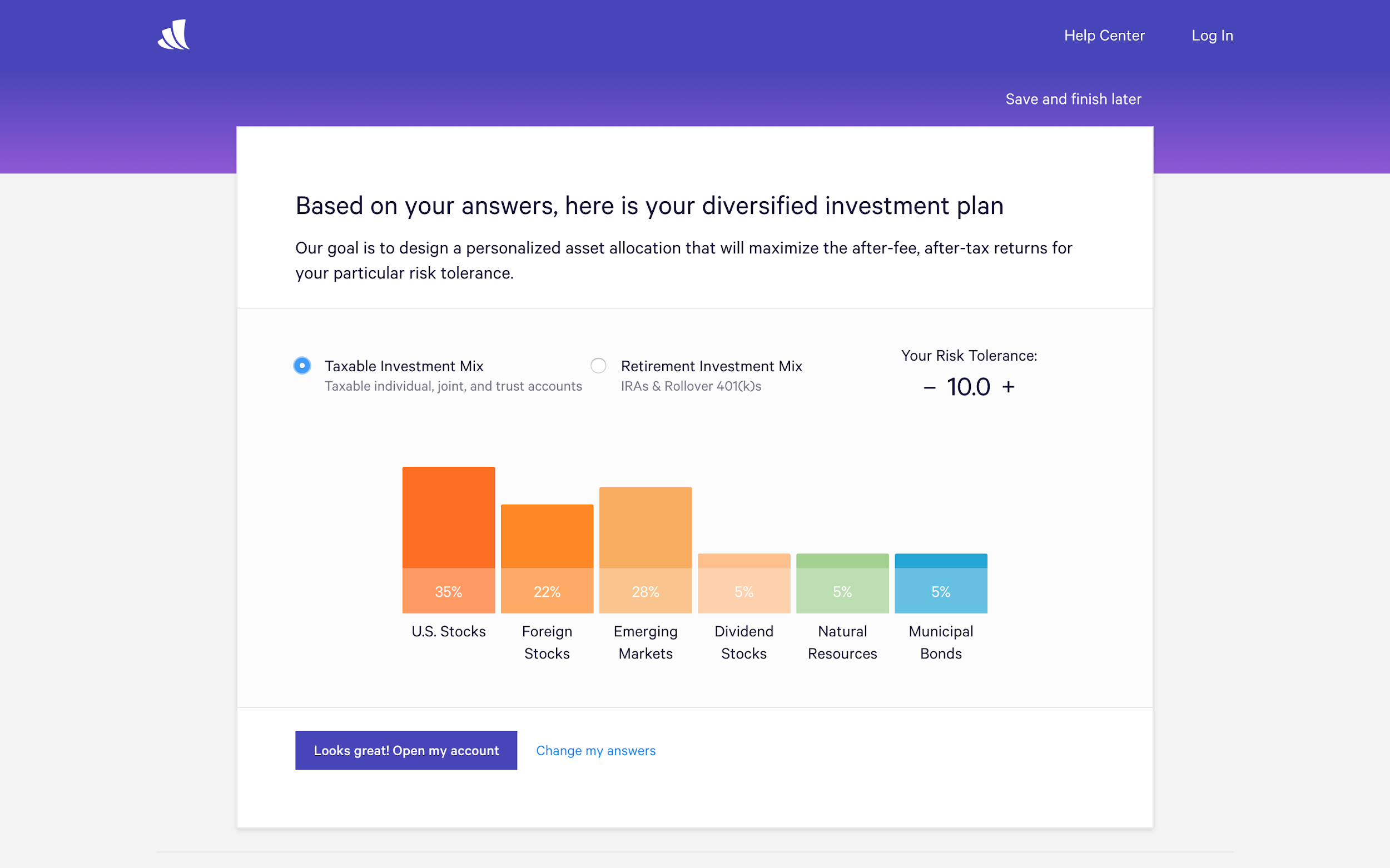
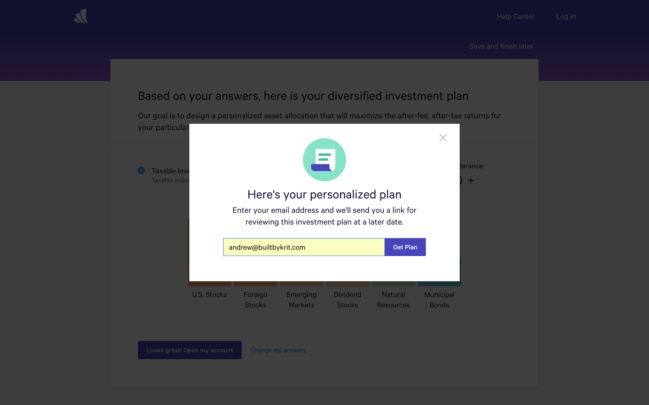
Wealthfront again does a great job with this. There are multiple actions you can take from this screen. But they make it obvious that the best option is to open your account (and talk about descriptive, encouraging button copy).
They still let you change your answers or save and finish later, but they make it clear these aren’t a priority.
On the other hand, consider the Needles homepage. Needles is an old-school case management application for personal injury attorneys.
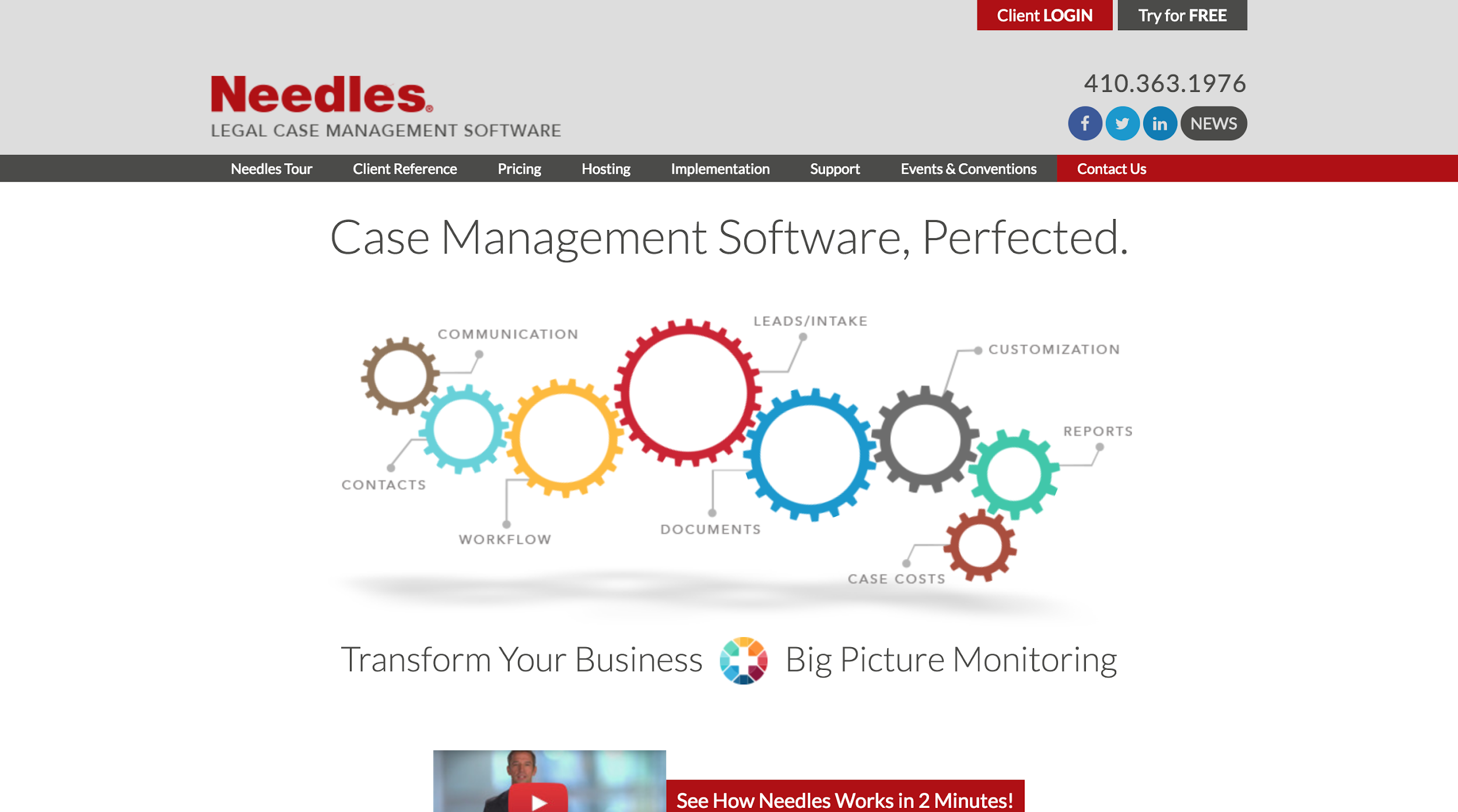
Looking at the home screen, it’s not at all obvious what you should do first. There’s a Client Login, but we’re not a client yet. News and Try it for Free have an almost equal visual weight!
5. Create non-empty states
Think back to the movie example we used at the beginning of the post. Have you ever been to a movie that required you to read through a series of slides before you started watching? Of course not! That would be absurd.
So, why would you force your users to endure the same thing?
Rather than forcing your users to sit through one of those annoying walkthroughs, make it easy for your users to learn on their own. Here are a few ways to do that:
Tasks that will help them be more successful
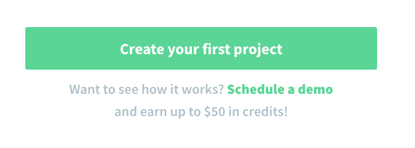
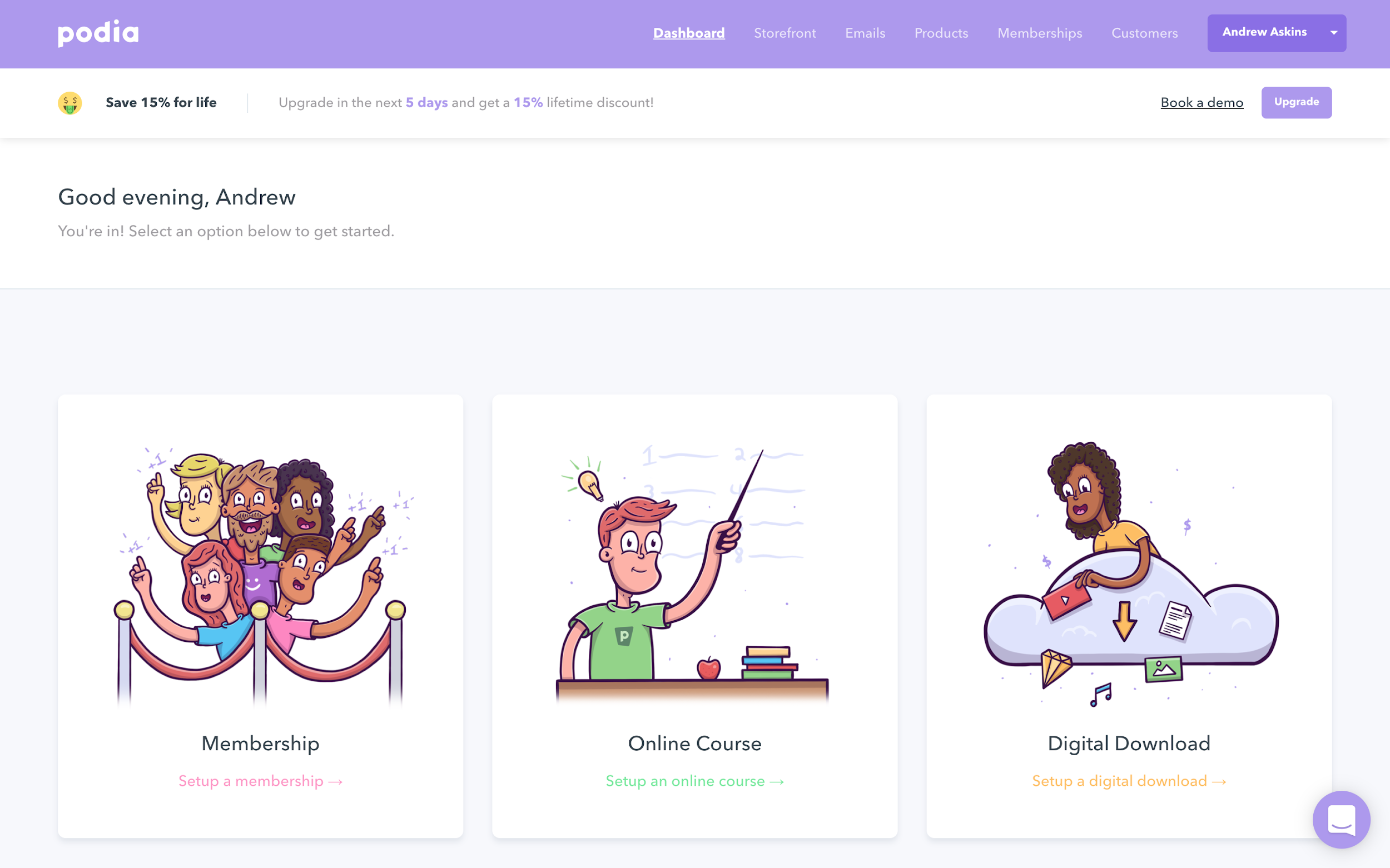
Consider placing a to-do list in the empty screen with tasks designed to help your users be more successful. Podia does an excellent job of implementing this strategy.
Sample data
Another great way to introduce your users to your SaaS app is by preloading data into their account. This gives them an easy way to explore the features you offer and imagine themselves using the app.
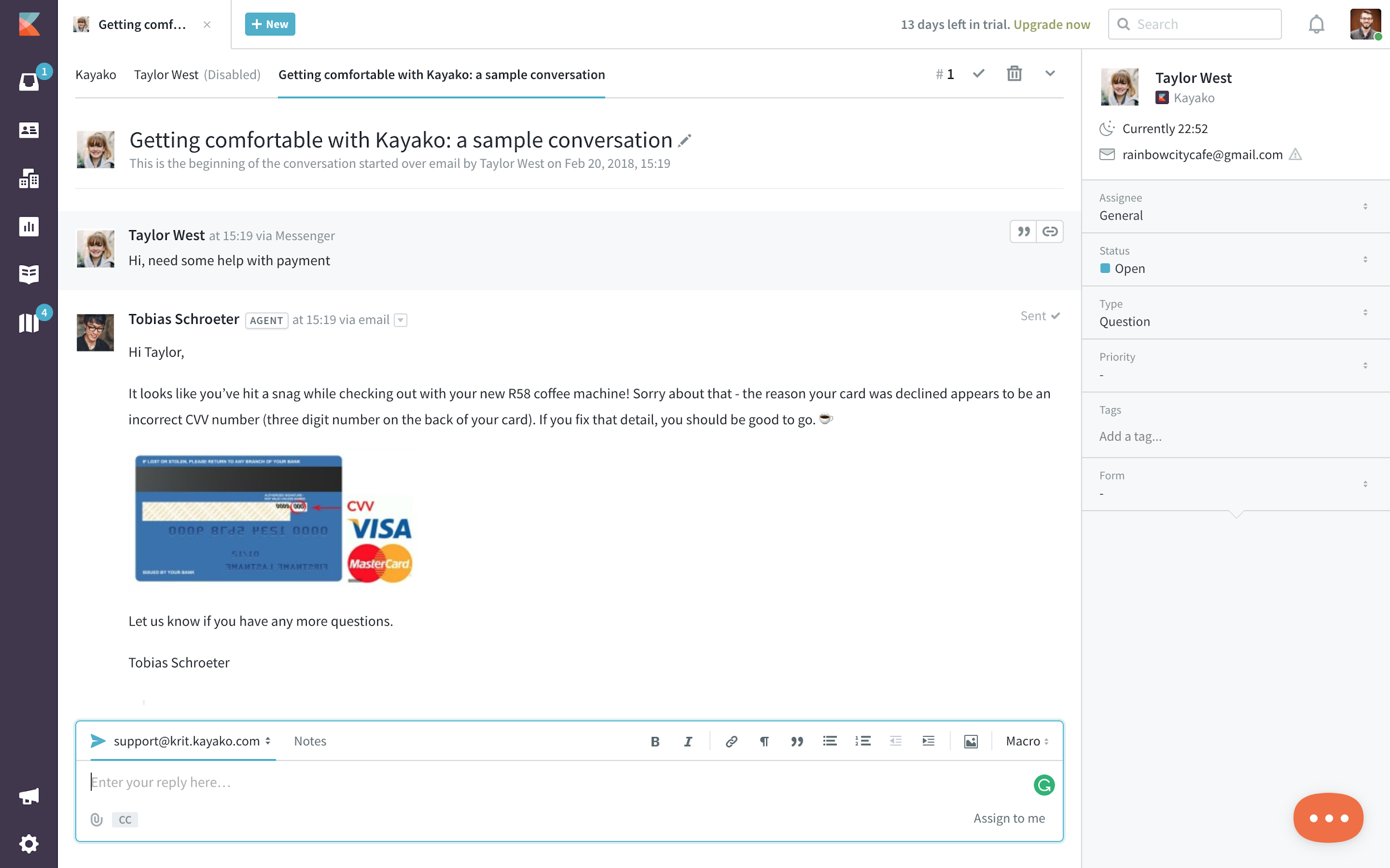
Kayako, the customer support software, does this well. When you first create your account, there’s already a sample conversation in your inbox.
Use your app to introduce your app
The most natural way to teach users how to use your app is by using the app yourself. What the heck does that mean?
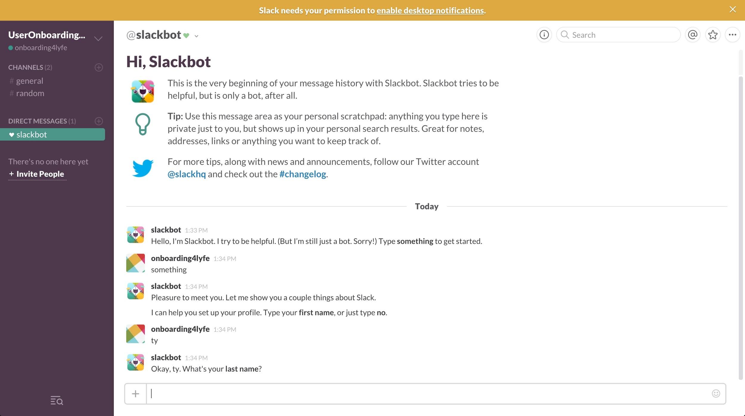
Props to Appcues post on the 5 best onboarding experiences for saving me from signing up for yet another Slack team.
When you first sign up for Slack, they have a bot that walks you through setting up your profile.
You use Slack to interact with the bot, and in doing so, learn how to use Slack as well.
You don’t have to build a bot to do this. If you’re building a project management tool, consider having a sample project with to-dos for your customers. Make it fit your platform.
BONUS: Webinars
Bonus strategy, woah! Since you made it this far, you get a bonus sixth onboarding strategy.
Webinars can add a ton to your onboarding experience, especially if you’re doing high touch sales. Webinars give you a chance to build a personal relationship with your customers in a scalable way.
They have been shown to increase customer lifetime value and trial-to-paid conversion. Which are the goals of any onboarding process.
Plus, by saving your webinars, you can create compelling content that users can always come back to.
Intercom, one of the fastest growing SaaS companies ever, hosts weekly webinars around product education. Users who join a webinar learn how to be more successful using Intercom, and they drop casual hints throughout about some of their other products.
24 hours after the webinar, the video recording is added to their Webinar page, creating a gallery of super high quality content.
Now that we've got your attention 🙂
Are You Ready to Experience Webinar Software from the Future?
No Credit Card Required - Get Started in Seconds.
Takeaways
Your onboarding experience has a huge impact on your bottom line. Better onboarding makes your users more successful, leading to higher conversion rates and lower churn.
You’ve worked hard to build a tool that will truly help your customers. You owe it to them (and to yourself) to make sure they’re getting the most out of your software.
To take your onboarding from B-list to Oscar-worthy, use:
- Social proof to build trust
- Helpful, human microcopy to educate and engage
- Gradual engagement to avoid overwhelm
- Clear visual hierarchies to highlight the most important path
- Creative empty states to get users up to speed
- Webinars to build a personal relationship at scale
Thanks so much for reading! I hope you found some useful strategies that you can start implementing today to improve your onboarding process.
Before you go, I have a quick question: Do you have your own tips for how to create an Oscar-worthy onboarding process? If so, I’d love to hear them. There’s so much you can do to create an incredible user experience. Or, do you have questions about how to implement one of these strategies in your app? Let me know!