


Simplicity saved our company.
We built a webinar platform with too many features. If we could draw it on a white board, we wanted it in our application.
We supported too many platforms by supporting web browsers, Mac OS X with an application, and Windows with another application.
Before we even launched our MVP, we started to feel like our entire team was stretched too thin. We were moving slowly, and we knew we’d move even slower once we had users/customers.
There were too many places where things could go wrong. Too many question marks.
We made the decision at the time to cut out more than half of our product and focus on just the core aspects of it.
It worked.
Since then, we have built simplicity into our DNA. Not just in our product, but also our company, our team, and in our personal lives. (I’ll be focusing mainly on the product design and development process for this article.)
Simplicity in our product has become one of our main unique selling points. It attracts and keeps customers. Our users love Demio for its simplicity.
Simplicity is not just about how something looks, or how something works; it’s the whole experience.
Simplicity is how something makes you feel. Simplicity in a product is about helping the user solve a problem or achieve a goal in an easier, faster, and better way.
A Narrow Focus
I don’t think you can achieve true simplicity without a narrow focus. Thus, knowledge is a precedent of simplicity, because you must know what and whom to focus on.
In order to build the right solution, you must understand the right user and the exact problem they’re trying to solve.
Through the thousands of personal 1-on-1 demos we’ve done, we’ve been able to identify our target customer, the problems they encounter, the objections they have, and the goals they want to achieve.
This information helps us dial in on our user and focus on things that specifically help that target customer.
We are building for one target customer instead of building for any potential prospect. Sure, it means we have to turn away a lot of prospects that aren’t a good fit, but it’s well worth the tradeoff.
It also means doing more with less.
Even though we have a smaller team, even though we usually only work 40 hours each week, we’re still able to get more done, because we’re focused on less. We’re focused on what actually matters.
Not only do we get more done, but we also better work.
Constantly Reassess and Reduce
Without deliberate reassessing, your product will naturally get more complex over time.
You start with an MVP, then you get users; those users request features, so you build more; you face prospect objections, and you build more again; your churn is high, so you build more.
You’re always building more.
Then you start to grow, and you face growing pains and scale issues, so you build more without taking the time to build properly.
Over time, your product becomes cluttered, unstable, and hard to learn.
In many ways, this is fine. Often times, it’s actually necessary and required to build a successful SaaS company. That being said, it leads to complexity.
So, how do we battle this natural direction towards complexity? The answer is by constantly reassessing your product, your features, and your architecture. The answer is by reducing what has become unnecessary instead of just always adding to it.
When we build new features, we try to think of everything from a foundational perspective. Meaning, “What might we add to this in the future?” and “Are we building it in such a way that will allow us to easily and naturally add to it?”
When we were originally building the webinar room aspect of Demio in the web browser, we needed an area for admins to be able to control the webinar.
Our MVP only had 1-2 features that would be needed by the admin, but we knew there would be other features coming in the future. So, instead of thinking about the easiest way to implement these 1-2 features, we set out to build a foundation that we could continuously build on top of for admins.
Thus, we came up with what we call the “Backstage Area.”
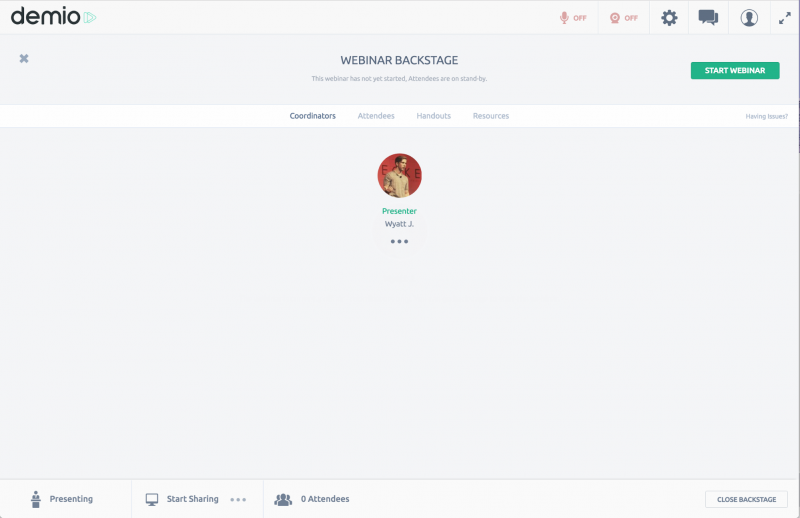
The Backstage area can be opened and closed at any time by any of the Coordinators; it’s a fun idea based on the concept of actual stages at real events.
Since launching, we’ve added new tabs to this area, such as Handouts and Resources, and we’ll be adding more in the future, too.
Because the foundation is already set up, we know exactly where the new features will go, and it won’t make it any more complex or confusing. This is a great example of how a simplistic product design can save you a lot of time and headaches in the future.
There have also been plenty of times during our product development process when we’ve had to completely reassess and redo pieces of the product in order to create a better, simpler user experience.
For example, we used to have a feature based around automation that was called “Triggers.” It allowed our users to set up IF/THEN statements for their webinars. We thought that because the triggers were “readable,” it would be easier to understand, but it just ended up being confusing:
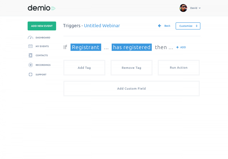
There was too much going on. The foundation was weak; there was no good way to add new options without making it confusing, and no easy way for the user to go back and edit early parts of these statements without erasing later parts of the statements.
Through constant reassessment, we decided that this area needed work.
We started by reducing…
If you look at the first part of the IF statement, you’ll see that it says “If Registrant” as opposed to “Attendee,” but what we realized is that everyone is actually a registrant, so there’s no need to ask the user about that. Also, being an attendee is more like an action.
When we made that realization, we decided to break things down into two categories:
Triggers and Actions.
And we came up with a completely new UI that visualized this:
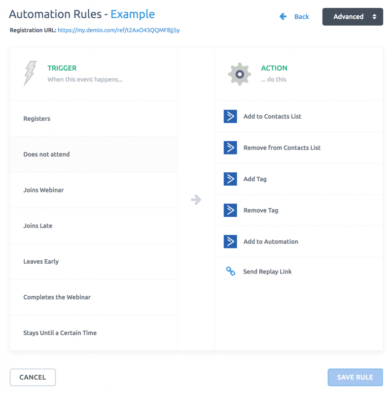
We reduced “IF” statements from being as long as 6-7 different pieces to always being just 2. Now, you can select any trigger and then select one or multiple actions that will fire based on that trigger.
It’s easier to understand, it saves time, and it’s more of a foundation that we can build upon as we add new triggers or any new actions.
Without this reassessment, we would have continued to build upon this shaky foundation, making Demio more complex and more confusing, especially for new users.

DOWNLOAD YOUR FREE WEBINAR STRATEGY CHECKLIST BELOW 
Use this checklist  to design your very own high-converting webinar marketing strategy from scratch, then automate the process to attract high-quality leads.
We promise to never spam or send emails about cats.
Okay, maybe some cat stuff.
Organize and Only Show What Matters
Have you ever logged into an application for the first time and gotten extremely overwhelmed by how many choices, menu options, and buttons are available for you to click on?
Achieving simplicity through organization is all about showing what matters and hiding what doesn’t (at the time).
It’s about understanding your user and knowing what stage of the product journey they are on.
As an example, at Demio, we want new users to run a webinar right away. We believe this is the best way for the user to get the full experience in a matter of minutes. We don’t want to scare them away with webinar set up, account settings, or a bunch of other features that don’t matter in the beginning.
So, instead, when they log in to their dashboard, they have a test webinar already created for them:
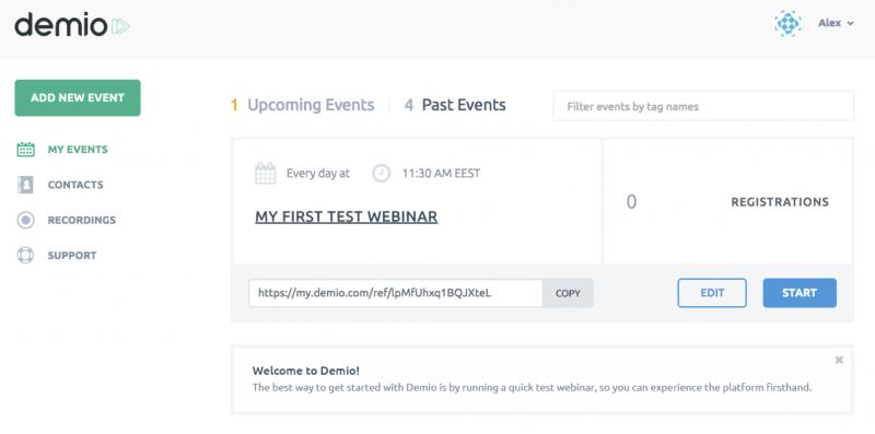
There’s very little happening here, and that’s our intention. We want the user’s first click to be on that appetizing, blue “START” button, so they can run their first webinar within a matter of seconds of logging in for the first time.
We didn’t have this onboarding to start, but we noticed a trend of almost ALL new users logging in and creating/running a test webinar for the first time.
We decided to save time for our users and, instead, create the webinar for them, so it’s already ready to run. Saving time feels like simplicity, and we’ll get to that later in this post.
In this example, we have removed all possible distractions. They’re hidden–out of sight. They’re just greeted with a simple, straightforward, and easy-to-use webinar platform.
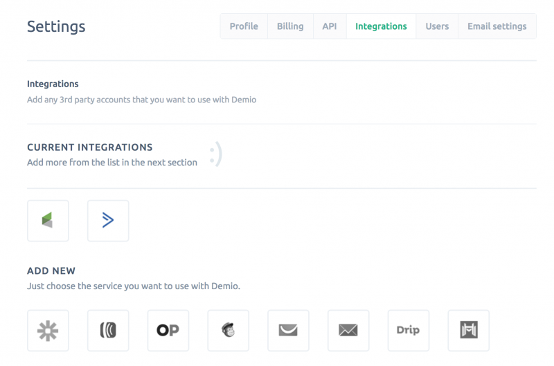
The simplest way to organize your application for simplicity is by understanding how often features are used. Features that are only used 1-2 times in the lifetime of a user should be hidden deeper in the application, whereas features that are used every day should be front and center.
As another example, we allow our customers to connect Demio to their other marketing automation tools, like CRMs and Autoresponders. In most cases, a user will only have to connect this one time, and then they’ll never have to do it again. It would be a waste of space and would take away from the simplicity if we allowed users to connect this on the main dashboard of our application.
Instead, users can get to this section in the settings area, which is just a couple clicks away:
Now, some users will navigate themselves, find this section, and add their integration right away. For others, we needed to think about their product journey and understand when the best time would be for them to add an integration.
After some thought, we came to the conclusion that it would be after creating a webinar and after editing the “registration” section of that event, which is where the user would instinctively think about connecting an integration in order to capture those registrations as leads.
If we notice the user doesn’t have any accounts connected in settings, we display a message with a link to get to the exact area where they can add their integration:
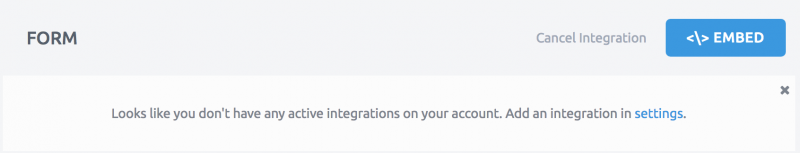
If they do already have an integration, then we don’t have to show this message; it’s hidden.
A perfect example of showing what matters to whom it matters, too, and hiding to whomever it doesn’t matter.
Add the Meaningful
It can be easy to get carried away when adding things to your product. By nature, you’ll be pulled in multiple directions from the customer to the marketing team, to the sales team, to strategic partners, and more.
In order to achieve true simplicity, you need to resist the noise and only add the meaningful.
Ask yourself, “Does this truly help a large percentage of our users and future customers?”
You should resist adding features that make your product “sexy,” but don’t add any true value to your product. In the short term, it may be necessary if your back is against the wall and you need to make sales, but, in the long term, it will create a bloated product that isn’t useful.
How can you tell if what you’re adding is truly meaningful? Well, if it helps your customers solve the same problem better, if it helps your customers save time, if it makes your customers’ lives easier, then it’s most likely meaningful.
If, on the other hand, you’re adding something that does not benefit users with the sole intention of selling your product, or satisfying a strategic partner, then you’re making your product more complex with no upside for current or future customers.
In the product design and development process, there is a constant battle between clarity and beauty. Both are important, but you should never sacrifice clarity entirely just to make something look beautiful.
When in doubt, err on the side of clarity, even if it makes things look less “clean.” Words instead of icons, for example.
In our reporting section for a past webinar, there are a lot of tabs that the user can access to see different aspects of the event. If we used icons here, the user would likely have to click on every single one to figure out what they mean:
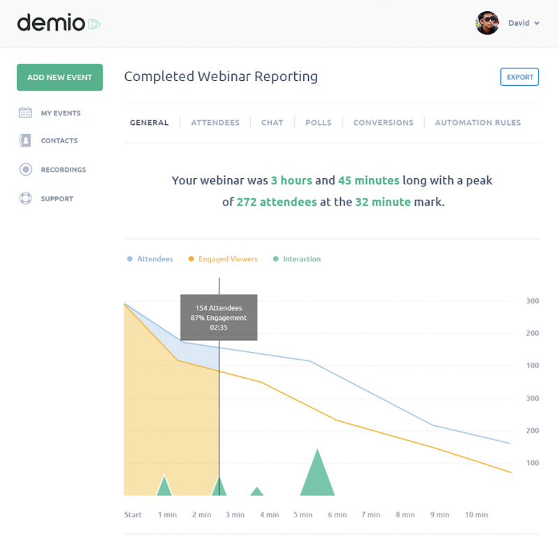
Instead, by using words, the user can easily read each tab to get a general idea of what will be shown. Maybe less sexy, but definitely clearer, and that’s a tradeoff we’re willing to make in order to achieve a better user experience.
Understanding WHY in Feature Requests
If you have customers, you have feature requests. You’ll get more feature requests than you could possibly ever implement into your product.
This presents a problem.
Of course, you want to cater to your customers, but not at the cost of making the product more complex for other users. Also, you simply don’t have the time to implement every feature request that you get. Nor should you, even if you did somehow have the time.
Some feature requests will make absolutely no sense for your product. Going back to what we talked about earlier with focus, you need to able to identify the problem you’re trying to solve for your target customer.
Users will request features that solve other problems for them, but may not be the main problem you’re trying to solve. In most cases, you should leave these problems to be solved by other solutions.
The most important thing with feature requests is truly understanding WHY the user is requesting that feature. This will give you deeper insight into the actual problem your customer is trying to solve.
“If I had asked people what they wanted, they would have said faster horses.” —Henry Ford
In most cases, people are limited to thinking about what they already know. This is why it’s important to understand the core problem, not the high level request.
As an example, we often get a feature request for a general webinar join link that anybody can join from, instead of the standard unique join links, which is how Demio works. By sheer volume of request, we would’ve already implemented this feature by now.
However, since we ask WHY, we’ve been able to learn that users mainly want this feature to host meetings without registration. That’s not the problem that we are trying to solve. As of right now, we are focused on webinars, not meetings.
While it might be great to eventually have a feature like this, it doesn’t align with our focus right now. It would add complexity, and it would solve a completely different problem for a different target customer. Even if there is a lot of overlap, we should leave this feature to be solved by other companies for now.
Saving Time Feels Like Simplicity
People value time above anything else.
When you save your users’ time, it will naturally feel like simplicity, because they’re spending less time to achieve the same task they were spending more time on before.
Let’s think about ride-sharing apps. Compared to a normal taxi, the experience is much more simplistic overall, and that’s mostly from the time that is saved. Instead of calling to request, you simply tap a button. Instead of taking out your credit card to pay, you just get out of the car.
For Demio, we wanted users to be able to join in the browser instead of joining from a downloaded app, like many of our competitors. It’s less friction, and it’s less time spent waiting.
As another example, we looked at the post-webinar process. Most people take their webinar recording, download it, and then upload it to a simple page. This takes a lot of time, not just because of the actual process, but because the user has to wait for the recording to process. Then, once it’s all set up, the typical user will email it to their audience using another software.
We saw room for improvement here. We saw a lot of unnecessary time wasted.
To take advantage of this opportunity, we decided to build automatic recording pages on Demio. As soon as a webinar ends, a recording page is generated and the video is hosted by us. We don’t allow a ton of customization here, because we’re not trying to be a landing page builder, but it does enable our users to quickly send out a replay.
On top of that, we allow our users to have the recording automatically emailed out to everyone who registered, to everyone who attended, or other segments.
So now, when a user ends a webinar on Demio, everything is already done for them. The cool part is that their time is saved for every single webinar they run on Demio; this is a huge value proposition.
It just makes things feel simple, because the user has to do less.
Great Customer Support
In my opinion, customer support is almost just as important as the actual product itself.
There are three ways you can express simplicity through support:
- By making it easy to contact support
- By providing multiple ways to contact support
- By giving fast, but also thoughtful responses
At Demio, we offer support in two ways. The first way is through Intercom chat support, which is similar to a live chat and can be accessed by the user at any time right from within their account. It sits on every page, and they can access it at any time:
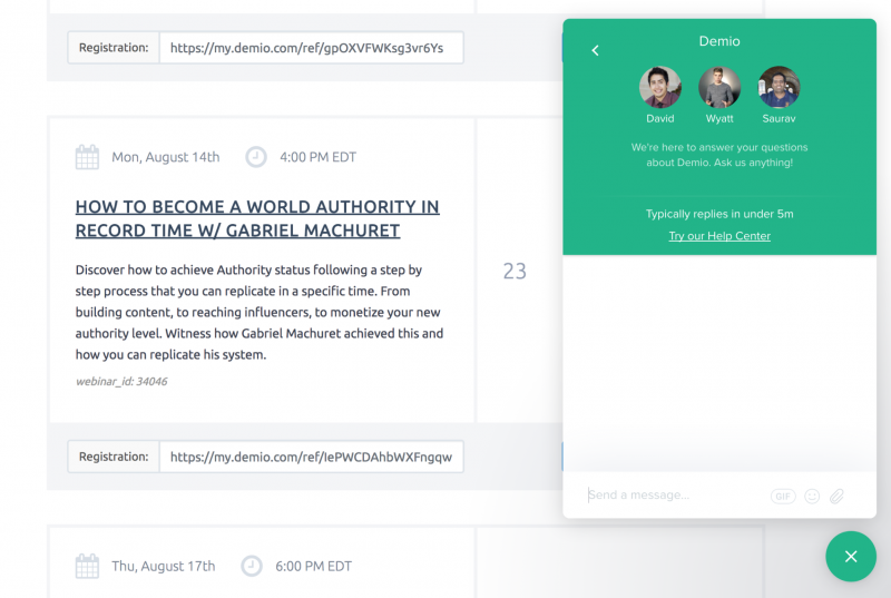
Unlike live chat, they can close it, leave, and come back at any time and the conversations will resume where they left off. This is obviously very convenient for users who are trying to solve quick problems or ask quick questions; it saves them a lot of time.
The second way is through Groove email support. A lot of customers actually prefer support through email. Since we give multiple options, they’re able to choose the option that better suits their needs at the time:
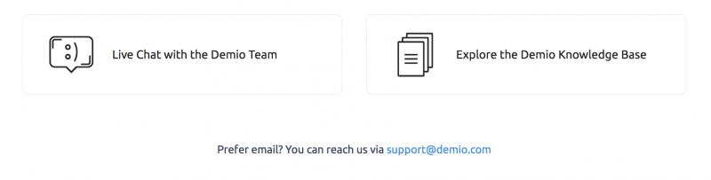
Through email, we can also take the time to provide more thoughtful, in-depth responses that usually solve the issue on the first response.
Our typical response time is less than 5 minutes. This usually goes way above and beyond the customer’s expectations, and it really sets us apart from our competitors. It allows us to provide a “complete” experience, instead of just a great tool.
On another note, It also allows us to build great relationships with our customers, which leads to a lot of growth opportunities.
So, through ease of use with support, less friction and fast response times, we are making our “product” even simpler overall, and we’re saving our users a lot of time and potential frustration.
By providing thoughtful support responses that give a lot of helpful information to the user, you can reduce the amount of times they need to reply, which, again, makes their life easier and saves them time.
Pricing and Terms
The final law of simplicity that we follow is related to pricing, terms, and not having contracts.
An important part of achieving simplicity is by being transparent in your business. Your product should be easy to understand. The value should be easy to understand. The pricing should be easy to understand.
Take a minute to think about cell phone companies that have hidden prices and super long contracts with a bunch of random fees. They all have multi-year contracts that are nearly impossible to get out of as well. This all makes the “product” seem complex.
Then, T-Mobile came along and did the exact opposite. They offered simple terms, no contracts, and unlimited data. It was refreshing, and it worked. They’ve been able to grow at insane rates year after year.
We keep our pricing simple and easy to understand, and we allow our customers to cancel, upgrade, or downgrade at any time.
We never want to force an unhappy customer to continue to pay for something they’re not using. That’s why we also offer a very clear money back guarantee on our website:

Not only do we allow our customers to cancel, but they can get their money back if they want to. This completely removes any pressure from the customer, and it removes the stress of testing a new product.
DOWNLOAD YOUR FREE WEBINAR STRATEGY CHECKLIST BELOW
Use this checklist to design your very own high-converting webinar marketing strategy from scratch, then automate the process to attract high-quality leads.
We promise to never spam or send emails about cats.
Okay, maybe some cat stuff.
Simple Product Design is Anything But Easy
Simple does not mean easy. Simple doesn’t just mean “less.” In fact, it’s actually usually a lot harder to achieve simplicity than otherwise.
Most things start out complex by nature. It takes real work to take something seemingly complex and make it seem simple. On the other hand, taking something complex and keeping it complex is easy. Similar to an ice sculpture, you have to constantly chip away to achieve the correct result.
Achieving simplicity throughout the product development process is a never-ending task.
It’s not something you do once and then walk away from. As long as your product is evolving and your company is growing, you’ll have to constantly work at achieving it, and your product will never be perfect; there will always be areas that can be reassessed and improved.
In the end, it’s worth it. Simplicity in your product can improve adoption, reduce churn, increase customer happiness, sky rocket usage, and fuel the referral flywheel.
That being said, it’s important to note that simplicity is not for everything. Some things should be complex, and they are complex. In fact, you can’t really have “simplicity” without the opposite; the contrast is a necessity. You can’t have darkness without light. You can’t have happiness without sadness.
You can’t have simplicity without complexity.
DOWNLOAD YOUR FREE WEBINAR STRATEGY CHECKLIST BELOW
Use this checklist to design your very own high-converting webinar marketing strategy from scratch, then automate the process to attract high-quality leads.
We promise to never spam or send emails about cats.
Okay, maybe some cat stuff.