Are you planning your first-ever webinar?
Or maybe your number of registrants isn’t where you want them to be?
The good news is, once your content is ready, you’re 50% done. The bad news? You still have 50% left, which is the webinar promotion.
Even if your content is gold, you still need to invest a significant amount of time into promoting it, especially if you want people to attend your webinar in real time.
Visual assets are an effective way to generate such exposure.
Stunning visuals not only draw eyes to your content, but also play a critical role in convincing your audience to smash that sign-up button. They also increase the chances of having your content shared.
I work at Piktochart, and in 2020, my company began to experiment with webinars and other video content formats. Since then, we’ve established our own #PiktoWebinar branding, and we’ve regularly organized at least two to three webinars per quarter.
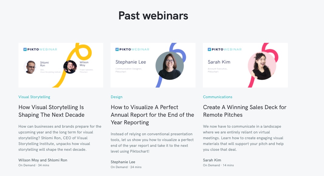
Each month, we create promotional assets highlighting our webinars to an average of 150 registrants per session.
Based on my experience, I’ve put together some tips for asset creation to help you promote your next webinar like a pro!
Webinar Slides
Whether you’re conducting a fireside chat, interview, or presentation, you need a slide deck. Slides help you convey your ideas while keeping your audience engaged throughout the session.
Tips to create an effective webinar slide deck include:
- Be audience-centric: Adapt the style of your webinar slides to connect with your audience. If your attendees are in finance, a classic tone may resonate more than an on-trend approach.
- Have one idea per slide: It’s not the number of slides that matters, but rather, the number of elements included on each slide. You want your audience to absorb your content effortlessly. So, instead of compressing as much content as possible onto each slide, focus on having only one idea per slide.
Here’s a quick rule to follow: Convey your idea using no more than six elements per slide. As David JP Phillips noted in his TED talk, How to Avoid Death by PowerPoint, it takes up to 500% more energy to digest more than six elements.
- Use visuals: Visual storytelling empowers you to communicate an impactful message with minimal time and effort. According to MIT researchers, the human brain can process an image in 13 milliseconds. Using visual aids to conceptualize your idea will increase the retention rate by 65% compared to only 10% with just verbal presentation.
- Create a template: Crafting slides from scratch for every webinar can be draining. That’s why I recommend creating a slide template you can reuse. It’ll save time as well as keep your branding consistent and professional.
It’s a good idea to prepare a variety of slide layouts. Your template should allow you to compare various ideas, share key stats, or summarize major takeaways. If you need inspiration, Piktochart offers many free presentation templates you can easily customize to your needs.
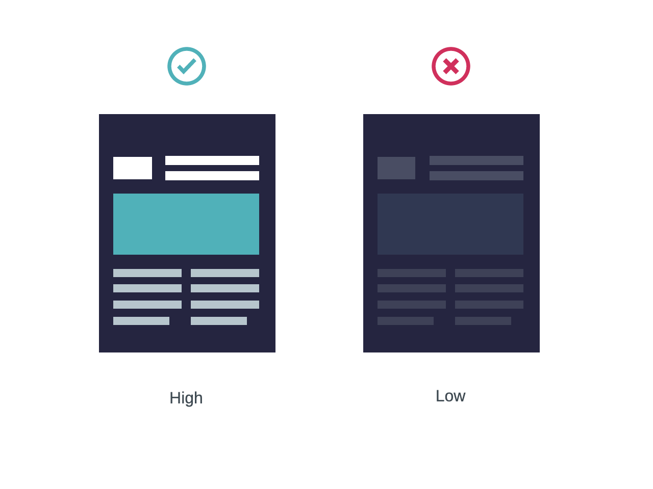
- Stick to one color palette: Choose a color palette consisting of two main colors and two secondary colors, and stick with it throughout your slide deck. This will keep your webinar presentation professional and consistent. Focus on using high-contrast colors that make it easy for the audience to read your text.
- Grab attention with a compelling title slide: The title slide should receive the most attention because it’s the first thing your audience sees. Many companies use the title slide for promotions or reuse it as a banner for their on-demand webinar page. Make sure your title slide stands out with your logo and an eye-catching visual.

Webinar Landing Page
A webinar without a landing page is like an airplane without a landing strip (pun intended).
You need a place to showcase all the great content you have to share. Enter the webinar landing page.
Not only does it sell your webinar and collect registrants, it also gives additional context, ensuring the people who sign up match your target audience.
Include a short description of what will be covered during the session. Highlight the main learning points and specify who should attend.
Here at Piktochart, Demio is our go-to solution for webinar hosting. Demio offers out-of-the-box landing pages that can be easily customized to fit our brand. Options to include our logo and brand colors on the registration page, in the webinar room itself, and on the replay page help us stay on-brand with every new webinar event.
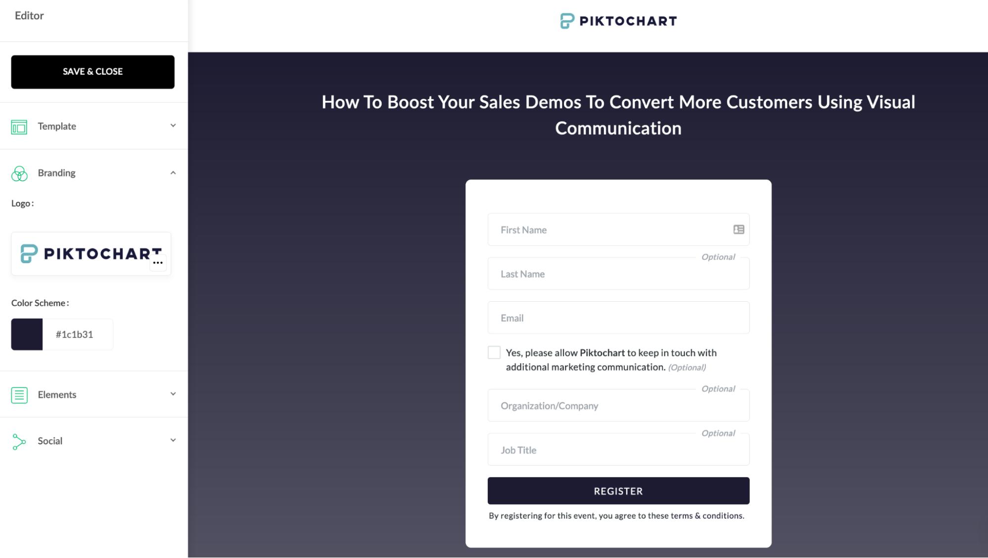
Additionally, we can also quickly introduce presenters to our audience using the Featured Presenters option, which adds their profile photo and a short bio. Introducing presenters on your landing page adds credibility, especially when running a partnership webinar with a subject matter expert.
Webinar Promotional Assets
Social Media Graphics
Social media is the perfect channel for spreading awareness about your upcoming webinar. But how do you make sure your promotional post grabs attention in the sea of other online content?
It’s similar to building a new relationship — you want to charm people by making a good introduction.
A webinar invitation is the first impression you make on your audience. You need to intrigue them so they’ll want to learn more.
So, what kind of information should you include in your webinar invitation? Not too much, but enough to tempt your target audience into taking action.
Below, I’ve summarized the most important elements:
- Webinar title: Similar to a webinar presentation, a strong title can make a big difference when promoting your webinar on social media. The goal is to catch your audience’s attention and ensure they understand what your webinar is about. You want to develop a catchy title or address a problem your audience is trying to solve. Keep your title short and clear enough to read from your visual.
- Speaker(s) photo and bio: Humans are drawn to humans, not brands. Your audience wants to know who they’ll be connecting with during the webinar. The speaker’s title or reputation can help them assess what they’ll learn and determine if it’s worth their time. Including the speaker’s photo, name, title, and company builds an initial connection and excites your audience. To take it a step further, give a little more context by including a short bio about the speaker in the post description.
- Timing: Time zones are crucial in the digital era. People who sign up might be on the other side of the globe, so don’t make them miss your webinar by being unclear about the start time and the timezone.
- Call-to-action: After you’ve hooked your audience, it’s time for a compelling CTA. We recommend including a visible button with a catchy phrase that’ll encourage action. For example, using “Reserve your spot” implies seats might be limited and creates a FOMO effect for the audience.
Pro tips for designing your social media promotional visuals include:
- List all the information you need to include. You don’t want to miss any of the important information above, so jot it all down or place it within the canvas.
It’s also important to be familiar with the social media platforms where you post your visuals. Each platform has specific dimensions and requirements, which you can find here.
You might not have a designer to help you with this. In that case, you could take advantage of professionally designed social media graphic templates offered by visual makers, such as Piktochart.
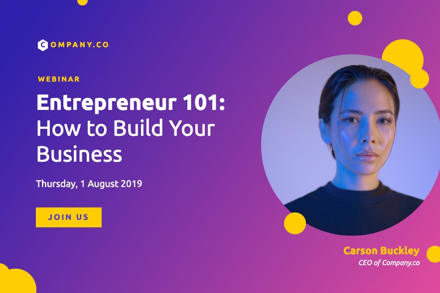
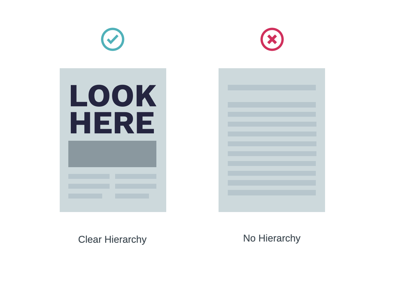
- Lay them out hierarchically. Place the most important information you want your audience to see at the top. In the majority of cases, it’s the title. Make it stand out. Then, add the speaker, time, and CTA.
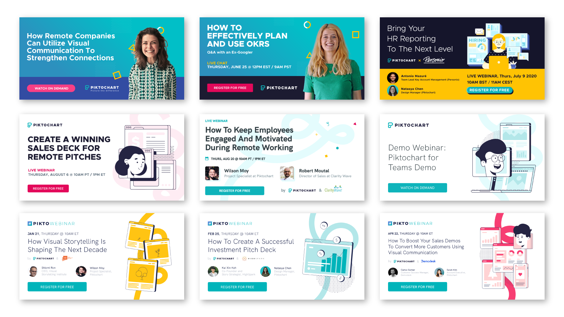
- Make it appealing to your audience. For our #PiktoWebinar, each webinar targets specific industries and job titles. We adjust the style to appeal to each target audience.
We experimented with different compositions, layouts, and styles before committing to the current incarnation. There’s no shortcut in this process. The more you test, the better.
We felt confident choosing illustrations. They’re consistent with Piktochart branding and help our visuals stand out in our audience’s news feeds. We turned it into our own template and have applied it consistently to all our webinars to date.
- Create templates. Templates aren’t only effective for webinar presentations; they can also save you a ton of time when working on promotional visuals. We use Piktochart’s Team Template feature to transform our promotional visuals into templates we can collaborate on with the marketing team. By turning them into custom templates, anyone within the team can start a new visual without worrying about the quality and consistency. This has saved us a lot of time and effort.
- Say “no” to stock images. We’ve realized how important it is to showcase speakers in webinar invitations. Your audience wants to see the face behind the name and job title. For that reason, we decided to include a portrait, but our mistake was using a stock image instead of an actual photo. We learned from our error and have only used speakers’ actual photos since then.
Videos
At Piktochart, we pre-record our webinars in advance. This is mainly due to differing time zones since our company operates across Asia, Europe, and the US. Having the recording on hand before the actual webinar release creates new opportunities for promotion. For example, we started posting bite-sized clips from the webinar on LinkedIn and Facebook to tease our audience.
These short teaser videos are usually less than a minute long and help our audience anticipate the knowledge they could obtain by attending our webinar.
Seeing the impact these videos had on promotion, Piktochart created Piktostory, a document-like video editing tool that helps you transcribe your webinar recordings and turn them into promotional clips ready to drive results on social media — all within minutes.
Since experimenting with bite-sized clips, we’ve noticed a significant increase in engagement on our social media channels compared to other types of promotional efforts.
Website Banner
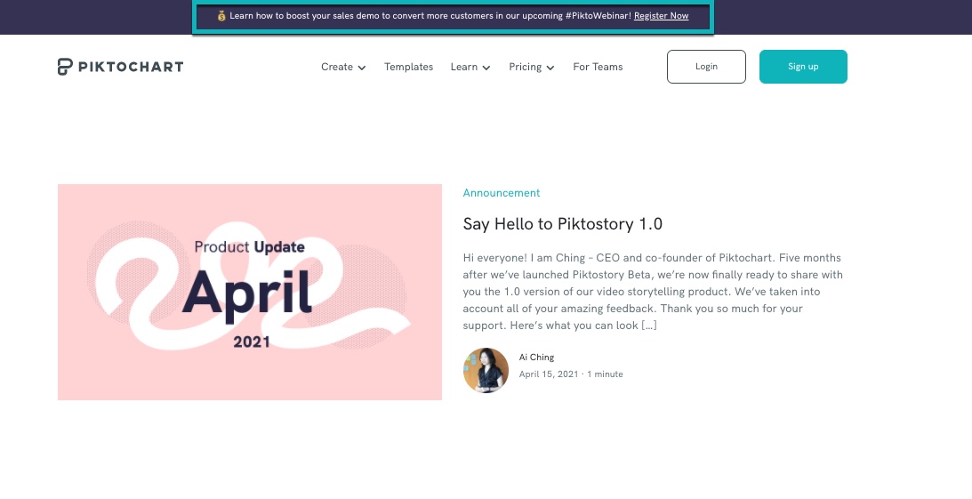
Beyond outbound promotion with social media, it’s also worth promoting your webinar directly on your website. Website banners and pop-ups are a great way to do that. Some of them might not follow you on social media, so this lets them hear about your webinar straight from the source. It’s a simple addition that yields great results!
Final Thoughts
PiktoWebinar allows us to connect with our audience around the globe. It provides a higher level of engagement than any other marketing activity for us. In contrast to ads, it’s something our audience finds valuable.
I hope the above tips will help you make your webinars more successful. It takes practice to get them right, but once you do, they have the potential to become one of your best lead generation channels.


